Turn boring organization charts into stunning ones using these designs

When it is time to outline a company’s structure or describe its hierarchy or relationships, nothing can beat a well-made organizational chart. It enables team members to know their duties, and at higher level, aids to coordinate all organizational activities efficiently. The main purpose of having an organization chart is that it assembles jobs into smaller segments. However, using simple lines and boxes to showcase the hierarchy of an organization has become outdated like the design below:

The diagram above looks dull. Isn’t it?
Let us discover some creative ways to transform your boring organization charts to some useful and outstanding ones.
Professional Organization Charts to Enhance the Look of Your Slide
In an organization, each department has its own purpose. Earlier, for the representation of various branches, presenters used the default colors and shapes provided in PowerPoint. But, with the passage of time this trend has changed. Thanks to the latest tools offered in the latest versions of PowerPoint, one can not only customize colors as per his choice but can also create unique shapes and sizes.
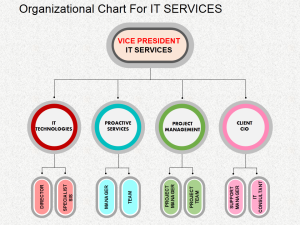
How about using different colors for different levels in a hierarchy, instead of the conventional method of using one standard color for the entire chart? As shown in the image below, you can use different colors for different departments and its workings. This facilitates in showcasing skills and knowledge of employees in each department in a more impressive way. This works aptly for small businesses too.

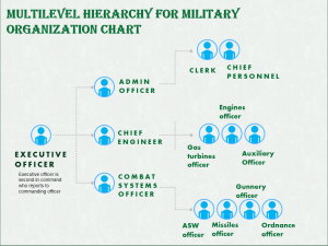
Generally, a divisional structure is used in big organizations. This helps companies to organize their divisions systematically. The advantage of utilizing this structure is that needs of an organization can be met more specifically. Moreover, the CEO of any organization can also have an easy access to various departments. Facilitating this type of organization chart will aid him to know about manufacturing services as well as the sales progress.

Also Read: Venn Diagrams: How and When to Use These in Your Presentation
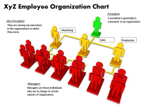
The management team is the team in charge to direct the organization towards its goal and targets. If the management team is strong, then the growth and development of an organization is certain. Adding to this, various managers have been allotted and assigned different duties. Here, the given template will provide you the apt assistance to represent your management team using various icons (a person taken as a representative symbol). These icons act as a good visualization tool when you do not wish to use pictures.

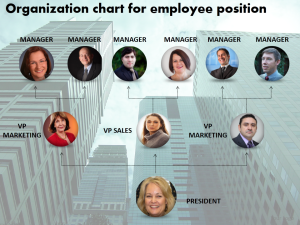
An organizational chart with pictures or images makes it even better by adding a personal touch to it. The organization chart works as a reminder to the team to work together effectively and motivates them to go higher up in the ranks. You can also use an image in background to make it more visually appealing. Your company building can serve as one of the many ideal backgrounds.
Click here to download this creative organization chart PowerPoint template
In an organization, a president is the one who is responsible for the management of all departments. To assist in the performance of these duties, the board members appoint other employees. This colorful 3D man based PowerPoint slide layout will captivate your audience. Moreover, one can easily understand the hierarchy of an organization that is highlighted in different colors.
Do not want too many changes in the structure? Let us try something innovative to make your otherwise dull organizational chart or slide an appealing one. How about adding some graphical effects that can make it look attractive! Doing some frame work will give 3D effect to your otherwise flat images. Using various colors will add icing on the cake.
Nothing is left unclear when relationships and divisions are organized perfectly using organizational chart. However, if you are bored of using top-down layout over and over again and no longer want to place one box below the other, why not try left to right or right to left orientation of the hierarchy? As shown in the following image, the sequence can be followed either one to many or many to one. Therefore, one can either place the higher official on the right side or can do vice versa.
Hence, through the organization chart it is ensured that activities are being performed and responsibilities are being allocated as they are required to be. Using our easily available Organization Charts PPT slide layouts, take your PowerPoint presentation to next level.