Learn To Create A Tornado/ Butterfly Chart In PowerPoint

A Butterfly Chart, also known as Tornado Chart, is a type of stacked bar chart which gives a quick glance at the difference between two groups of data with the same parameters. It is an amazing visualization technique to make better and informed business decisions.
This chart resembles the shape of the butterfly, hence the name Butterfly Chart: the body represents the core concept and wings represent creative ideas emerging from the core. This chart can also be used for sensitivity analysis. It is, however, more apt for comparison purpose.
Now that you know what a Butterfly Chart is, let us create one in PowerPoint.
Follow these steps to design this creative visual in PowerPoint itself!
What you will learn to create in this Tutorial:

Steps to Create Butterfly Chart in PowerPoint:
Step 1- Insert a Bar: Stacked Bar Chart
The butterfly chart is created with the help of a stacked bar chart. Therefore, the first step involves inserting a stacked bar. For this:
- Go to the Insert tab and select Chart
- From the dialog box click on Bar and select the Stacked Bar option located on the top (as shown in the screenshot below)

A stacked bar is now inserted in your slide.
Step 2- Enter your desired data
The next step involves the formulation of data based on which your butterfly chart will be designed. The datasheet will automatically open when you insert the stacked bar chart. If it doesn’t open, right-click on the chart and select the Edit Data option.
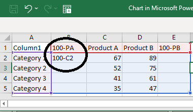
Here is a sample of data that we have used to structure our butterfly chart. Taking reference from this example, structure your data accordingly.

After entering the data the chart will automatically adjust to it and will look something like this:

Step 3- Add 3 New Columns
To make the chart look like a butterfly chart we have to add some extra columns. We need to add three new columns to get the desired results.
The number of columns depends upon the structure of the butterfly chart that you want to create. So, choose the number of columns wisely as it lays the foundation for your butterfly chart. In order to add extra columns, follow these steps:
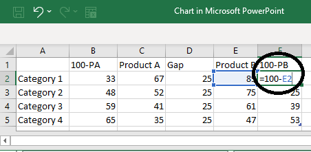
1. Column B (100-Product A)- Insert a column to the left as we have added. Select column B showing Product B, right-click on it, and select Insert> Table Columns to the Left.
NOTE- We have chosen 100 as our number since our sample data is taken out of 100. If your data is taken out of 1000, mention that instead of 100. The figure depends upon your sample data, you can alter it as per your requirement.
Then add the formula to calculate the figures. The formula is 100-C2. After applying the formula the values will be automatically calculated.
Don’t forget to replace 100 with your figure.
2. Column C- Data of your Product A
3. Column D- Gap-To makes your chart look like a tornado or a butterfly chart it is important to add a gap between two adjacent bars. Name this column as Gap and add an equal number in it. Here we have added 25. This number can be increased or decreased depending upon your data series.
4. Column E- Data of your Product B
5. Column F (100-Product B)- In the last column which in our case is F apply the formula 100- E2 and all the values of Product B will be calculated automatically.
The final data structure will look something like this:
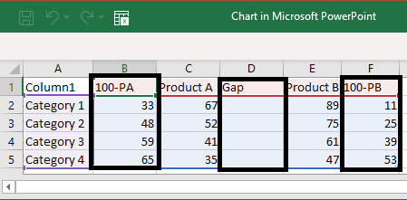
Also, this is how your stacked bar will look like:
Step 4- Change the color of the Added Bars
We only require the yellow and orange bars that represent our Product A and Product B. Rest all other bars are extra and so we have to format them by changing their color. For this, right-click on the bar and click on Fill> No Fill.
Also delete all the extra parts like the categories, gap, 100- PA, and 100-PB as marked in the screenshot below.

Also Read: How To Create A Pillar Diagram To Lay A Solid Foundation.
Step 5- Add Data Labels to Gap Series
The next step involves renaming the gap series and labeling it as categories. For this:
- Select the gap series (transparent bars located in between the orange and yellow bars)
- Click on the + button outside the chart
- A dialog box showing Chart Elements appears from which select Data Labels
- Next up is to click on More Options
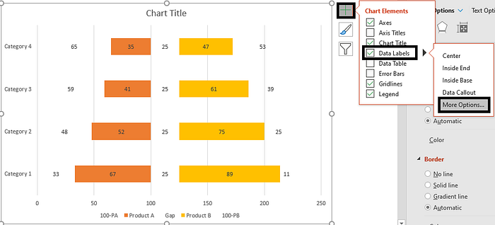
- Format Data Labels window will open towards your right-hand side
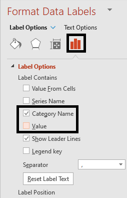
- Go to the Labels Options, and tick mark the Category Name checkbox
- Also, deselect the Value checkbox
- Follow these steps for all the values and bars
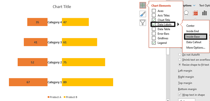
The gap series will now be filled with the categories just like we wanted. You can also increase or decrease the size of the text from the Home tab.

You can now reposition the labels and the values. For this select the values and click on the + button. A dialog box opens from which select Data Labels> Inside Base. The values will automatically be adjusted as shown in the screenshot below.
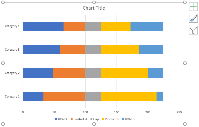
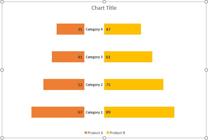
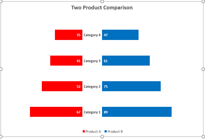
This is how the final Butterfly Chart will look like:
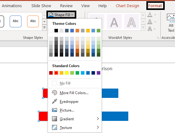
You can also format its color. To do so:
- Right-click on the bar
- Go to the Format tab and select Shape Fill
- Select the color of your choice from the box
This is how your butterfly chart with changed color scheme looks like:
Follow these steps and create this amazing visual in a matter of seconds!
Did you find this tutorial helpful? Tell us in the comments below and stay tuned for more!